Часті питання
Вступ
1. Концепція:
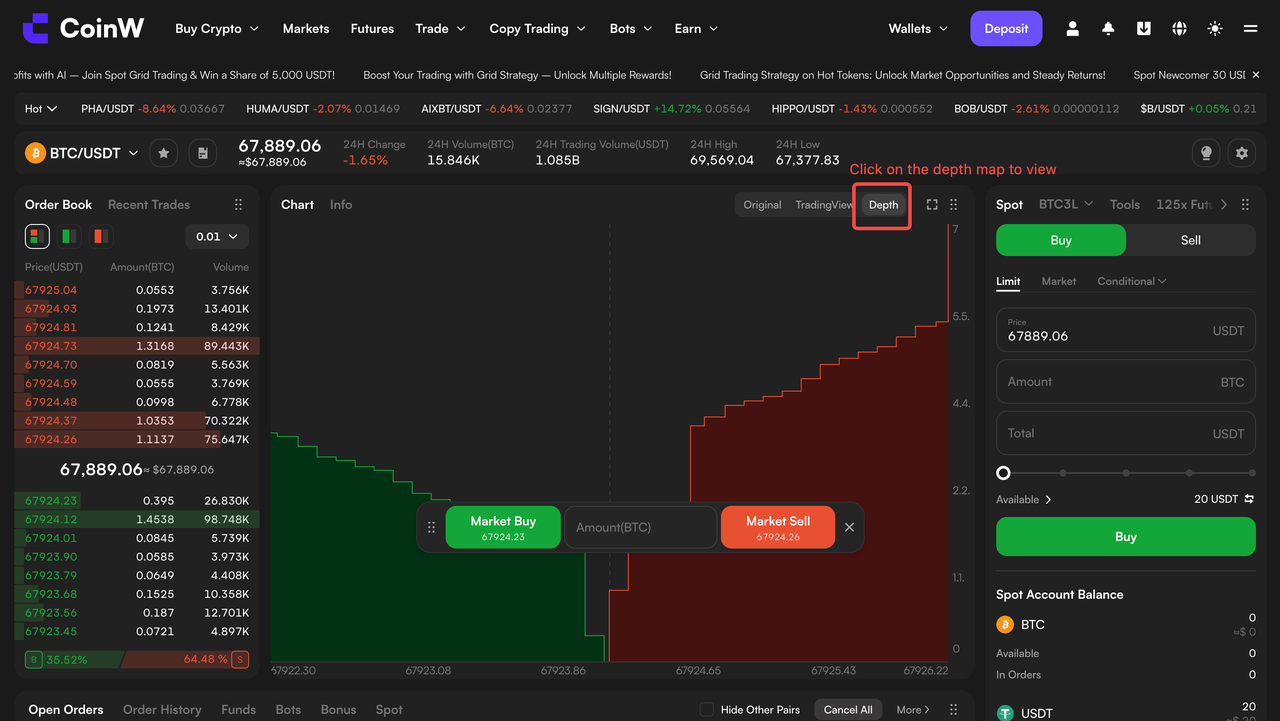
Графік глибини ринку на CoinW візуалізує дані книги ордерів. На відміну від свічкових графіків, які відображають історичні рухи ціни, depth chart показує поточний стан ринку та короткостроковий баланс попиту і пропозиції. Він допомагає чітко зрозуміти, чи переважають на ринку покупці чи продавці, а також де зосереджені великі ордери.
2. Основні компоненти
Графік глибини складається з осі X, осі Y та двох кольорових зон:
Вісь X: відображає ціну, яка зростає зліва направо.
Вісь Y: відображає кумулятивний обсяг ордерів (загальну кількість відкритих заявок).
Зелена зона (bid): представляє ордери на купівлю. Оскільки покупці зазвичай більш активні на нижчих рівнях ціни, зелена зона зростає справа наліво.
Червона зона (ask): представляє ордери на продаж. Оскільки продавці зазвичай більш активні на вищих рівнях ціни, червона зона зростає зліва направо.
Середній розрив: точка, де сходяться зелена та червона зони, відповідає поточній ринковій ціні. Порожній простір між ними називається спредом.
3. Що можна визначити за допомогою depth chart
Ринкові настрої (тиск купівлі vs. продажу)
Якщо зелена зона більша за червону, це свідчить про сильніший попит і потенційне зростання ціни.
Якщо червона зона більша за зелену, це свідчить про сильніший тиск продажів і потенційне зниження ціни.
Вступ
1. Концепція:
Графік глибини ринку на CoinW візуалізує дані книги ордерів. На відміну від свічкових графіків, які відображають історичні рухи ціни, depth chart показує поточний стан ринку та короткостроковий баланс попиту і пропозиції. Він допомагає чітко зрозуміти, чи переважають на ринку покупці чи продавці, а також де зосереджені великі ордери.
2. Основні компоненти
Графік глибини складається з осі X, осі Y та двох кольорових зон:
Вісь X: відображає ціну, яка зростає зліва направо.
Вісь Y: відображає кумулятивний обсяг ордерів (загальну кількість відкритих заявок).
Зелена зона (bid): представляє ордери на купівлю. Оскільки покупці зазвичай більш активні на нижчих рівнях ціни, зелена зона зростає справа наліво.
Червона зона (ask): представляє ордери на продаж. Оскільки продавці зазвичай більш активні на вищих рівнях ціни, червона зона зростає зліва направо.
Середній розрив: точка, де сходяться зелена та червона зони, відповідає поточній ринковій ціні. Порожній простір між ними називається спредом.
3. Що можна визначити за допомогою depth chart
Ринкові настрої (тиск купівлі vs. продажу)
Якщо зелена зона більша за червону, це свідчить про сильніший попит і потенційне зростання ціни.
Якщо червона зона більша за зелену, це свідчить про сильніший тиск продажів і потенційне зниження ціни.